
Websites are still one of the most reliable ways to build and maintain an online presence, along with social media. They introduce your brand, explain what you do, and often make the first impression long before a conversation ever starts. But they also exist in a crowded environment: according to recent data, more than 1.4 billion websites are live today, and only a fraction of them manage to attract steady traffic on a monthly and yearly basis. Against that backdrop, standing out is no longer a matter of clever copy or neat layouts. It comes down to how quickly a site loads and how effortlessly it communicates trust, all of which are shaped by images.
To prove the point, research consistently shows that photos and images draw more attention than any other visual element on a page, which means the files you upload begin shaping opinions within seconds. As such, the brain processes images in about 13 milliseconds, far quicker than text, allowing uploaded files to shape opinions within seconds during scans.
But not every image counts. Heavy images can slow a site down and push users away; undersized ones can look soft, pixelated, or careless. In both cases, the message is the same: something feels off.
This is where image size becomes less of a technical detail and more of a practical decision. This guide takes a practical look at image sizing for websites in 2026 and breaks down which dimensions work best for different sections of a site, how size and format affect performance, and what to keep in mind if you want your visuals to load fast and look credible.
Recommended Image Sizes for Websites in 2026
Perfect image sizing for the web mainly implies matching image dimensions to the space they occupy and the role they play on the page rather than chasing a perfect number.
It’s not a cosmetic detail. It affects how fast a page loads, how stable a layout feels, and how search engines interpret a site’s overall quality. Regardless of file format, oversized or poorly scaled images tend to create the same problems: slower load times, awkward cropping, and visual inconsistency. For that reason, most image guidelines are less about aesthetics and more about matching dimensions to function.
Let’s take a look at the recommended sizes for various types of website images.
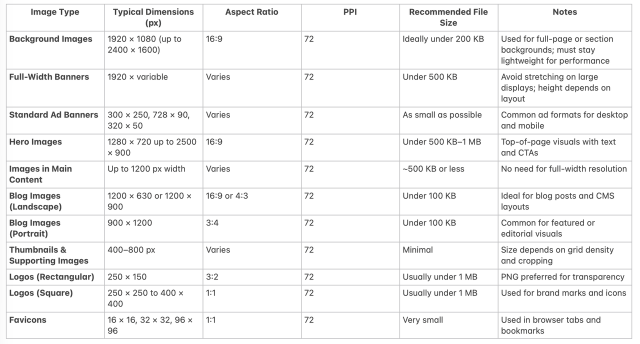
Background Image
A background image stretching across a homepage or a full-width banner carries unique requirements. A size of 1920 × 1080 pixels at a 16:9 aspect ratio covers most desktop displays, while still remaining manageable in terms of weight. Some layouts allow for larger files, up to 2400 × 1600 pixels, as long as the image stays compressed and the PPI remains at 72. File size matters here: background images should stay light, ideally under 200 KB for performance-sensitive pages.
Full-Width Banners
Full-width banners also typically sit around 1920 pixels to avoid visible stretching on large displays. Common formats include 300 × 250 pixels for medium rectangles, 728 × 90 pixels for leaderboards, and 320 × 50 pixels for compact mobile placements. Design banners used inside a website layout are more flexible. On desktop screens, they often range between 1200 and 1600 pixels in width and 300 to 500 pixels in height. Aspect ratios vary, but keeping the resolution at 72 PPI helps control file size without harming clarity.
Hero Images
Hero images sit somewhere between banners and backgrounds. They often occupy the top portion of a homepage or landing page and combine visuals with text and calls to action. Typical hero images start around 1280 × 720 pixels, but wider designs may push the width closer to 1800 or even 2500 pixels. Heights usually stay below 900 pixels to avoid pushing key content too far down the page. A 16:9 aspect ratio works well in most cases, and keeping file sizes under control helps preserve fast loading times.
Images in Main Content
Images placed inside the main content area rarely need full-width dimensions. In most layouts, 1200 pixels is sufficient to maintain sharpness while keeping file sizes efficient.
Thumbnails and Supporting Visuals
Smaller visuals, such as thumbnails or supporting images, can be much smaller, usually ranging from 400 to 800 pixels, depending on cropping and how many appear on screen simultaneously.
Logos
Logos are among the smallest images on a website, but their requirements are specific. Most logos fall between 250 and 400 pixels in width and use either a square (1:1) or rectangular ratio such as 3:2. A typical rectangular logo might measure 250 × 150 pixels. Transparency is usually required, which makes PNG the preferred format. File sizes rarely need to exceed 1 MB.
Favicons
Favicons are even smaller and serve a different purpose. The classic favicon size is 16 × 16 pixels, but larger versions such as 32 × 32 or 96 × 96 pixels are commonly used to ensure clarity across devices and browser contexts. These images always use a 1:1 aspect ratio and a standard 72 PPI.
Blog Images & Content-Specific Graphics
Blog images are more predictable. They usually sit within a content column and do not need to span the full width of the screen.
Layout and image type influence what “best size” means in practice:
- Blog images often work well around 1200 × 630 pixels (however, the ideal size may depend on the CMS you use).
Landscape blog images often work well at 1200 × 900 pixels, while portrait-oriented featured images may use 900 × 1200 pixels. Compared to other image types, blog visuals benefit from stricter file size limits — keeping them under 100 KB is often enough to maintain both clarity and speed.
- Small rectangular logos may only need 250 × 150 pixels.
The goal is not to upload the largest file, but to match the image to its container so the browser avoids unnecessary scaling.
File Size Considerations
Pixel dimensions tell only half the story. File size directly affects loading speed, often long before a page feels “heavy.”
- Files larger than 20 MB can severely slow a site and should be avoided in production.
- For most web pages, images under 2 MB are safer, with ~500 KB serving as a practical benchmark.
- Modern compressed formats like WebP reduce file size without obvious quality loss, making them widely used for web delivery.
Aspect Ratio
Aspect ratio ensures predictable layouts:
- Standard landscape images typically fit 16:9 or 3:2 ratios, which adapt well across screens.
- Square images are usually 1:1 and common for profile photos, icons, and product previews.
Using a small set of ratios reduces awkward cropping and uneven spacing as layouts adjust.
Resolution
Web images do not need print-level detail.
- 72 PPI is sufficient for on-screen use if dimensions are appropriate.
- Higher PPI increases file size without visible benefit for typical browsing.
Accessibility: Alt Text
Image attributes like alt text do not affect loading speed but are important for accessibility:
- Alt text allows screen readers to describe images to users relying on assistive technology.
- It also provides context when images fail to load.
- Keep text short and clear, ideally under 100 characters.
Best Image Formats For Website Design
A website does not have to rely on a single image format. In practice, most sites use a mix, choosing formats based on what each image needs to do. Product photos, interface elements, animations, and downloadable assets all place different demands on quality, file size, and compatibility. Getting this balance right affects loading speed, visual clarity, and how easily search engines process a page.
JPEG vs PNG vs GIF
For decades, JPEG has been the default choice for web images, and it still appears almost everywhere. Its strength lies in how efficiently it compresses photographs and images with complex details such as shadows, gradients, or natural textures. JPEG files are relatively small and widely supported, which makes them practical for everyday use. The trade-off is lossy compression: when a JPEG is reduced in size, some visual data is discarded. The result can be mild blurring or artifacts, especially after repeated edits, even if the loss is subtle to most viewers.
PNG takes a different approach. It uses lossless compression, which means image quality stays intact no matter how often the file is saved or resized. This makes PNGs a common choice for interface elements, icons, and logos. Another reason they remain popular is transparency support, which allows images to blend cleanly into different backgrounds. The downside is file weight. PNGs are heavier than JPEGs and are rarely suitable for large, photo-heavy sections unless carefully optimized.
GIFs sit in a narrow but familiar niche. They support simple animation while keeping file sizes relatively low, but at a cost. With a color limit of 256 shades, GIFs often look flat or washed out. For detailed visuals, they fall short. Even so, their universal browser support and ease of use keep them alive in website graphics, emails, and lightweight animations where speed matters more than precision.
Alternative Image Formats on a Website
Some formats are rarely used directly on websites but still play a role behind the scenes. Bitmap files, for instance, store every pixel without compression, which results in large files and slow load times. They are typically reserved for design work where image fidelity cannot be compromised and are converted to lighter formats before publishing.
- EPS files serve a similar purpose for vector-based graphics. Because they rely on mathematical data rather than fixed pixels, they scale cleanly at any size and preserve color accuracy. However, browser support is limited, and edits require returning to the original design file.
Newer formats have begun to shift how websites handle images.
- AVIF, originally developed for video compression, has gained attention for its ability to deliver high visual quality at smaller file sizes. It supports transparency, animation, and high color depth, making it suitable for still images that need heavy compression without obvious quality loss. While browser support is improving, AVIF does not render progressively, meaning the image must fully load before appearing on screen. In practice, this is less of an issue because the files themselves are often smaller than their JPEG or PNG equivalents.
Design formats such as PSD and INDD are not intended for direct web use, but they are central to how images are created and maintained.
- PSD files allow designers to work with layers, making revisions and adjustments easier over time. INDD files serve a similar function for multi-page layouts and complex design projects. Both formats must be exported into web-safe types before publishing, as browsers cannot reliably display them.
- TIFF files round out the list as a format known for preserving image detail and metadata. They support multiple color models and compression methods, which makes them useful for high-resolution visuals and archival work. Their larger file sizes, however, limit their usefulness on live websites, where performance is a concern.
Because of this wide range of options, many modern websites have settled on WebP as a default delivery format.
- It’s considered that WebP files are noticeably smaller than JPEG and PNG versions of the same image while preserving comparable quality. They also support transparency, which allows them to replace both formats in many scenarios. That said, no single format works everywhere. WebP suits most photos and interface elements, GIF remains useful for simple animations, and SVG works well for icons and scalable graphics.
In the end of the day, choosing an image format is less about following a rule and more about matching the file to its role. A fast website relies on lightweight formats, a clean interface depends on sharp edges and transparency, and downloadable assets may call for flexibility rather than speed. The best results come from using the right format in the right place, rather than forcing one solution across the entire site.
Why Are Image File Formats Important?
For most visitors, images set the tone before a single word is read, signaling quality, attention to detail, and the care put into a site. They shape first impressions, influence engagement, and guide how users perceive a brand’s credibility. Choosing the right image formats can affect more than just how a page looks; it directly impacts usability, performance, and the way visitors interact with your content.
Page Loading, Visual Information Perception & Easy-to-Scan Content
One of the most immediate benefits is faster page loading. Speed matters at the exact moment someone decides whether a site is worth their time. Around 70% of consumers say page speed influences their decision to purchase, meaning oversized images or inefficient formats can reduce conversions and revenue. Using formats that balance clarity and file size keeps images sharp while trimming weight, so pages load quickly without turning photos into blurry or pixelated blocks.
High-quality visuals are another key advantage. About 65% of people process information visually, which makes the fidelity of images more important than many websites consider. The right format preserves details, keeps text legible within images, and ensures color consistency across different screens and browsers. Poor choices, on the other hand, lead to compression artifacts, blur, or uneven rendering, all of which distract from the design and erode credibility.
Images also make content easier to scan. Users rarely read pages line by line, especially when evaluating options or searching for specific information. Visuals break up text, highlight key points such as benefits or processes, and maintain engagement as visitors scroll. Web-optimized formats ensure these images remain detailed while keeping pages responsive, avoiding delays or stutters that can interrupt the scanning process.
Finally, images strengthen brand storytelling. They communicate personality, values, and intent in ways that words alone rarely can, particularly for complex concepts. Consistent, high-quality visuals across a website (from the homepage to product pages and case studies) help visitors build a clear sense of who a brand is and what it stands for. The right image formats maintain that coherence, ensuring that the story the site tells visually matches the experience visitors expect.
How to Optimize Image File Size for Your Website
Optimizing image file size is one of the most effective ways to improve website performance, user experience, and SEO. Large, uncompressed images slow down page loading, frustrate visitors, and can even affect search engine rankings. The process of optimization involves more than just resizing; it combines proper dimensions, compression, and metadata management to deliver visuals that look professional without weighing down your site.
4K Image Compressor and Similar Solutions
A practical first step is to use image optimization tools, desktop and online. Services like 4K Image Compressor, TinyPNG, Squoosh, and ImageOptim reduce file size while preserving clarity.
Modern compressors condense similar pixels and remove metadata, lowering page weight and accelerating load times. Faster loading matters: research shows that a delay of just a few seconds can increase bounce rates by over 30%. On digital devices, the slight loss in quality from compression is usually imperceptible.
Experimenting with different tools can help you find the one that best fits your workflow and needs, but let’s take a look at how 4K Image Compressor works.
4K Image Compressor is an easy-to-use desktop application, compatible with Windows, macOS and Ubuntu devices, which allows you to compress images and PDF files (even in batches) and convert images into various formats. Let’s see how it works:
- Install 4K Image Compressor on your device.
- Launch the app.
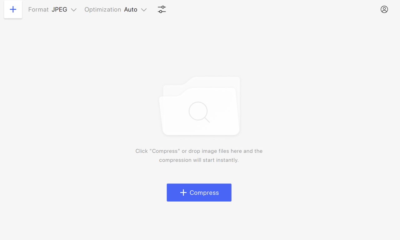
- Choose the Format of the output file.
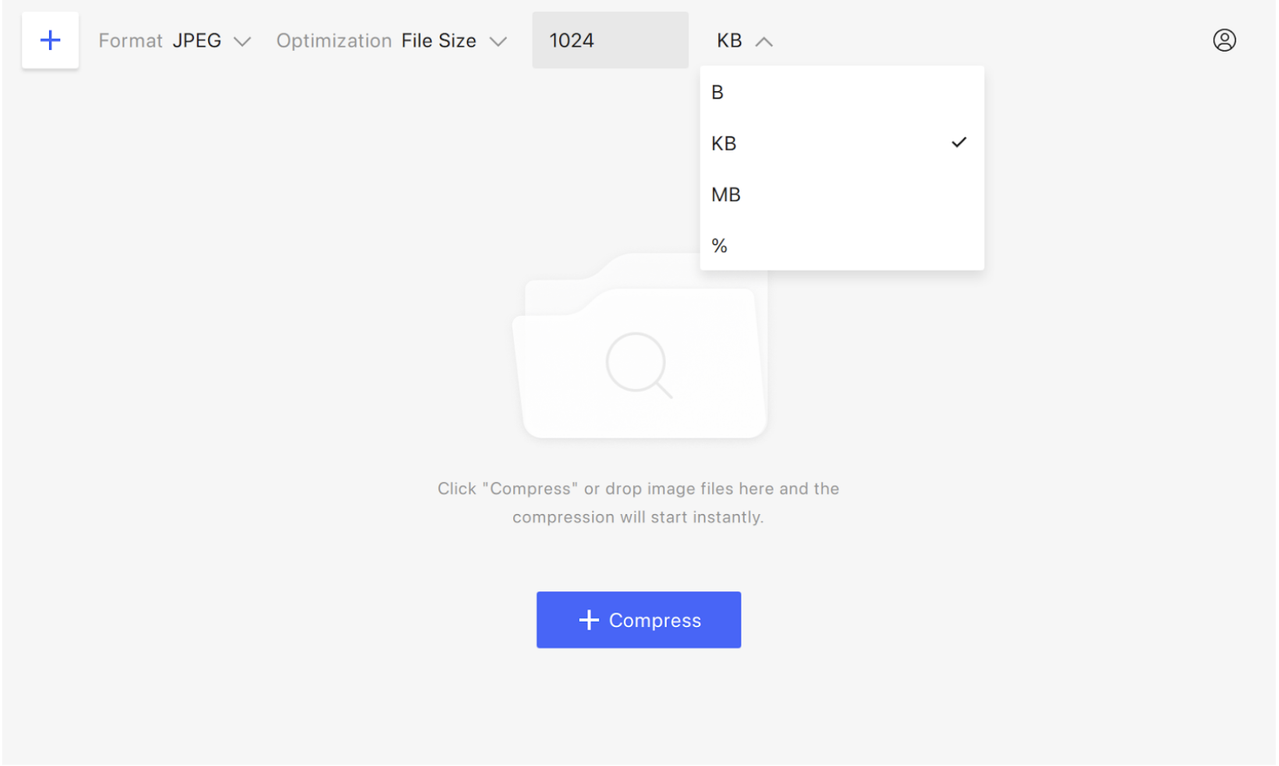
- Select the Optimization type. You can choose Auto, Lossless (unavailable for JPEG compression), and File Size. The latter setting implies that you can compress an image by a certain percentage or a specific amount of MB, KB, or even bytes.
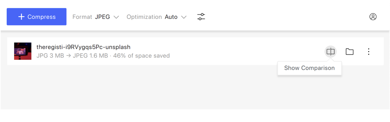
- Drag and drop an image and press Compress.
- Press Show Comparison to make sure no quality is lost.
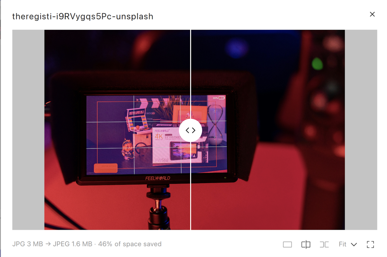
- Click on the image right in 4K Image Compressor to open the resized file.
Dimension Adjustment
Dimension matching is equally important. Images should reflect the actual display size in your page layout. Uploading an image that is far larger than the section it occupies, for example a 3000-pixel-wide photo into a 1200-pixel container, increases file size unnecessarily and slows page load times. Ensuring images match their intended layout not only improves speed but also prevents distorted or blurry displays.
Original Images Are Preferred
Other SEO-focused practices include using unique, original images rather than stock or repeated visuals, assigning descriptive file names, and generating an image sitemap. These steps make it easier for search engines to index images, improve visibility in image search results, and contribute to better page rankings.
In short, optimizing images is a multi-layered process. Correct dimensions, careful compression, descriptive alt text, and proper file management all combine to keep pages fast, maintain visual quality, and enhance search engine performance. Properly optimized images improve the user experience while helping your website work efficiently for both visitors and search engines.
How to Find Out Image Sizes for Your Website or CMS
Image sizes vary depending on the website platform and design. Different content management systems (CMS) and themes have their own recommended dimensions, while custom-built sites may follow entirely different guidelines. Understanding the proper image size for your platform ensures visuals display clearly, load quickly, and maintain the intended layout.
Shopify
For Shopify users, images can be uploaded at up to 5000 × 5000 pixels, with a maximum file size of 20 MB and a resolution of 72 DPI. While the platform supports very large images, the recommended size for square product photos is 2048 × 2048 pixels. Many Shopify themes also include documentation that lists preferred image dimensions for banners, thumbnails, and other page elements, making it easier to follow best practices.
WordPress
WordPress sites have their own standards. Recommended images usually do not exceed 1024 × 1024 pixels, though this can vary depending on the theme. Featured images, for example, are often designed with a 16:9 aspect ratio, such as 680 × 382 pixels, to fit seamlessly within the theme’s layout. Most themes provide documentation or guides that outline the best dimensions for headers, posts, and thumbnails, helping users ensure consistency across their site.
Ghost
To find image sizes on a Ghost CMS site, inspect images directly in the browser or check your theme settings. Right-click an image in a post or the admin media library and choose Inspect to see its file size and URL in DevTools (Network → Img). Ghost stores originals (up to 2000px wide) and serves responsive variants based on the active theme’s image_sizes config. For bulk checks, export site content or run a Lighthouse audit to review image sizes and optimization.
Other Websites
Custom-built websites require a different approach. Developers typically provide specifications for image sizes that match the unique layout and design of the site. Following these guidelines is essential for maintaining visual clarity and preventing distorted or slow-loading images.
In all cases, checking the documentation provided by your CMS or theme, or consulting with your developer for custom solutions, is the most reliable way to determine the ideal image sizes for your website. By using images that fit the intended layout, you ensure pages look polished, load efficiently, and provide a smoother experience for visitors.
 SHARE ON TWITTER


Thanks for feedback
Your comments will appear here shortly. Please spread the word about us in social networks.